Fueled By Ramen
Rise Records
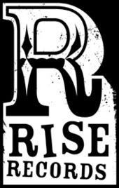
 Rise Records is an American, Oregon-based, record label. Rise was founded in 1991 by Craig Ericson in Nevada City, California. He released a small number of 7" records before putting the label on hiatus to attend college. Ericson didn't release anything further until 1999, after moving to Portland, Oregon. The label has a distribution deal with Alternative Distribution Alliance, the indie distributor owned by Warner Music Group and directly in Europe and Australia with Warner Music and BMG. The logo is similar to FBR with the fact that it is in black and white and has a letter larger than the others. However the font used gives it a slight retro and vintage look, giving off the idea that the record label is quite alternative.
Capital Records
 Capitol Records is an American record label part of the Capitol Music Group and a wholly owned division of the Universal Music Group. The label was founded as the first West Coast-based record label in the United States in 1942 by three industry insiders,Johnny Mercer, Buddy DeSylva, and Glenn Wallichs. In 1955 the label was acquired by British music conglomerate EMI as its North American subsidiary. Capitol's circular Los Angeles headquarter building (Capitol Records Building) is a recognized landmark of California - allowing the logo to be quite simple and recognisable with using a famous landmark' it also allows the logo to look quite professional compared to the other two logos but also keeps us with the black and white theme.
No comments:
Post a Comment